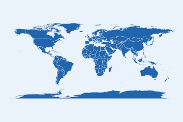
“World data on a map” has many honest forms. A choropleth is only the
first. The package offers a full vocabulary; this vignette tours the
ones that draw on the bundled polygons, which need nothing installed,
and points to the rest, which need sf or
biscale as well.
Proportional-symbol (bubble) maps
For totals, a choropleth misleads: large values hide in small countries. Sized circles at centroids are the right idiom.
bubbles <- suppressWarnings(bubble_map(snap, population))
bubbles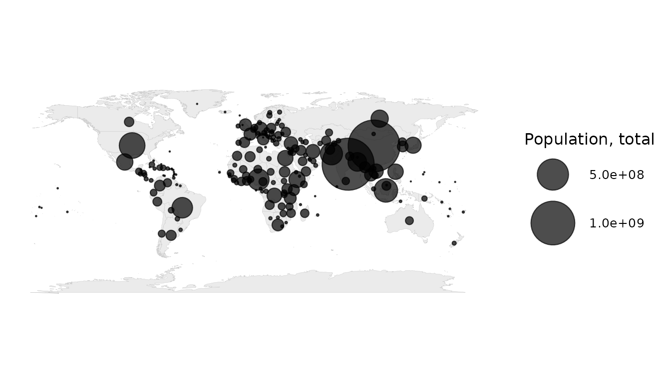
Spike maps
The same “totals” job as bubbles, with a different overplotting trade-off: spikes only grow upward, so dense regions (Europe, the Caribbean) stay legible.
spike_map(snap, population)
Both verbs place one symbol per country centroid, and the basemap does not draw every code in the codelist. On this snapshot one country with population, Gibraltar, has no polygon at 1:50m and so no symbol. Each verb warns and names it, and counts it as missing rather than shown:
Equal-area tile grids
Give every country the same visual weight so micro-states are
visible. The bundled grid covers 247 countries – see
?world_tiles for the three it omits.
tile_map(snap, gdp_per_capita)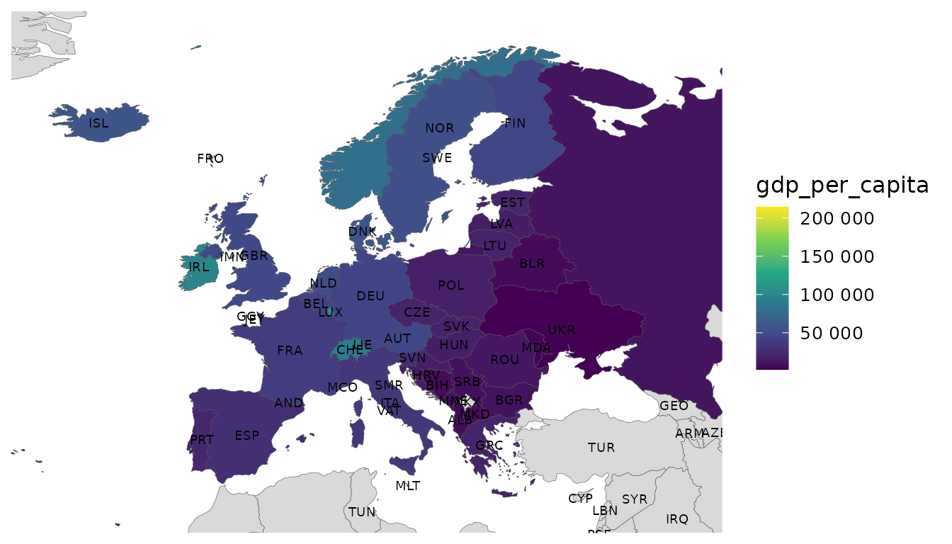
Flow maps
Great-circle arcs between country pairs from an origin–destination table.
od <- data.frame(
  from   = c("China", "Germany", "Brazil", "Nigeria"),
  to     = c("United States", "France", "Argentina", "India"),
  weight = c(500, 200, 90, 60)
)
flow_map(od, from, to, weight)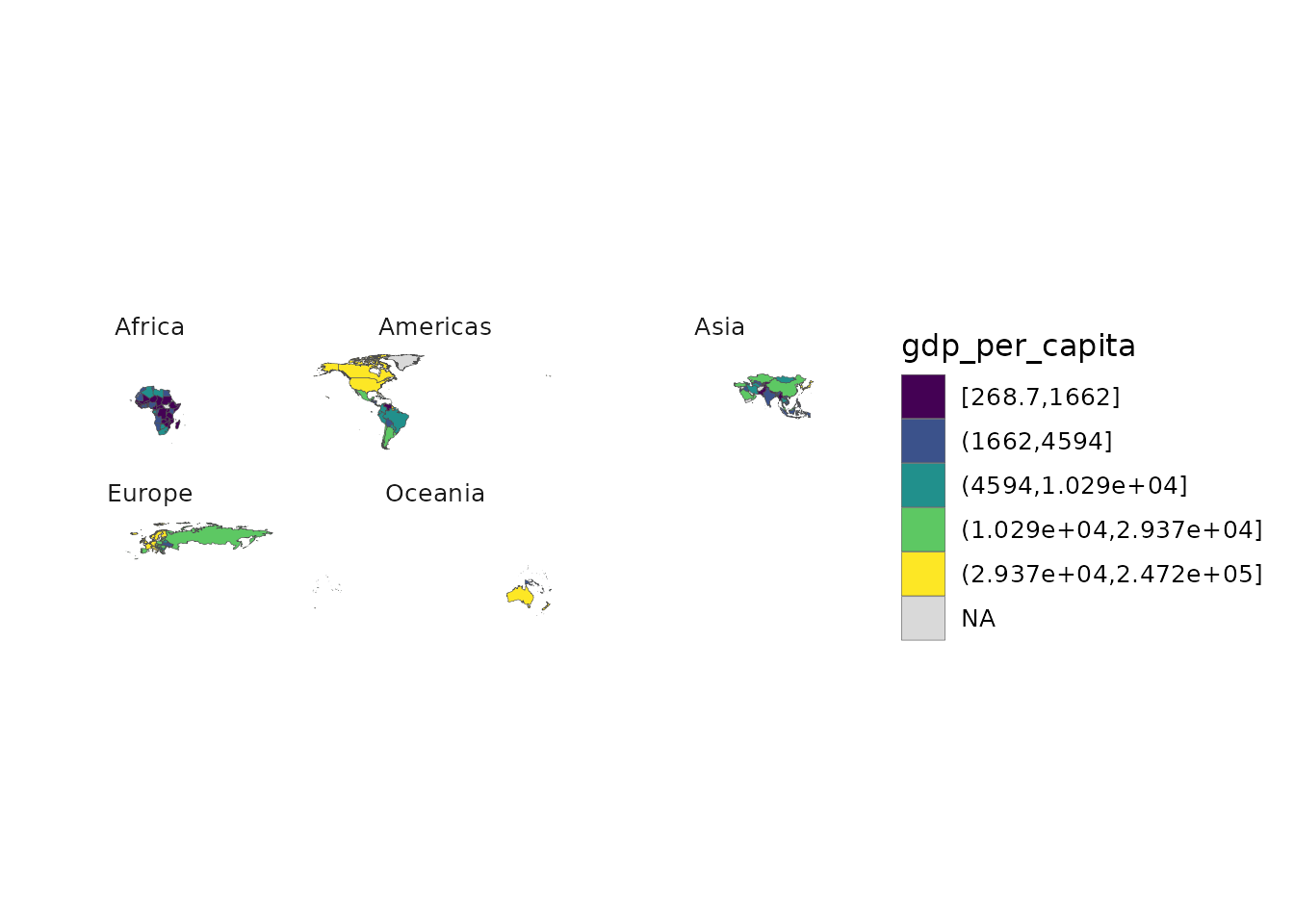
Small multiples
facet_map() splits one choropleth into per-group panels,
the static counterpart to animate_world(), for print and
side-by-side comparison:
world_poly <- attach_geometry(snap, geometry = "polygon") |>
  dplyr::filter(!is.na(continent))
facet_map(world_poly, gdp_per_capita, continent, style = "quantile", ncol = 3)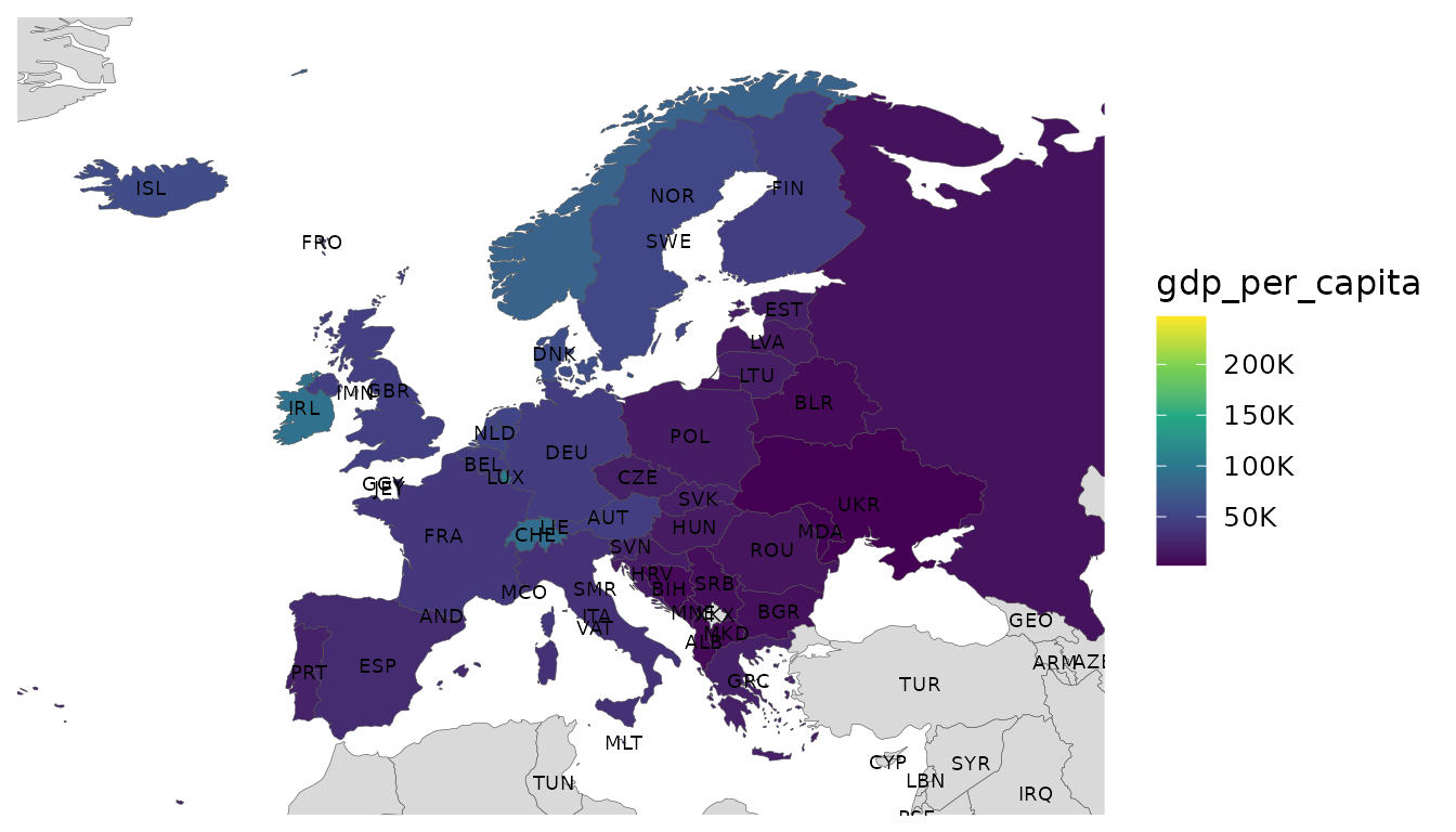
Labels
Centroid-anchored labels (names, ISO codes or flag emoji), with
ggrepel collision avoidance when available. Zoom with
zoom_map(), which takes longitude and latitude limits and
keeps the map’s projection: adding
coord_quickmap(xlim, ylim) would replace the projection
with an unprojected one.
mapdf <- attach_geometry(
  dplyr::filter(snap, continent == "Europe"), geometry = "polygon"
)
(world_map(mapdf, gdp_per_capita) +
   geom_country_labels(repel = FALSE, size = 2.5)) |>
  zoom_map(xlim = c(-25, 45), ylim = c(34, 72))
Maps that need optional packages
The remaining displays follow the same one-call pattern but require optional packages, so they are shown here as code:
# Bivariate choropleth (two variables at once): needs `biscale` + `sf`
world_data(2020, c(gdp = "NY.GDP.PCAP.KD", life = "SP.DYN.LE00.IN"),
           geometry = "sf") |>
  bivariate_map(gdp, life)

# Area-honest cartogram: needs `cartogram` + `sf`
world_data(2020, c(pop = "SP.POP.TOTL"), geometry = "sf") |>
  cartogram_map(pop, type = "dorling")

# The same Dorling cartogram as a first-class verb, with its tuning exposed
world_data(2020, c(pop = "SP.POP.TOTL"), geometry = "sf") |>
  dorling_map(pop, k = 4)

# The fast flow-based cartogram (Gastner-Seguy-More): needs `cartogramR`
world_data(2020, c(pop = "SP.POP.TOTL"), geometry = "sf") |>
  cartogram_map(pop, type = "flow")

# Animated choropleth over a year panel: needs `gganimate`
world_data(2000:2020, c(gdp = "NY.GDP.PCAP.KD")) |>
  animate_world(gdp)

# Interactive choropleth: needs `leaflet`, `ggiraph` or `plotly`
world_data(2020) |>
  interactive_map(gdp_per_capita, engine = "plotly")
Value-by-alpha: the cartogram’s non-distorting cousin
A cartogram equalises a denominator by deforming geometry.
value_by_alpha_map() does it by spending opacity instead,
so the world stays recognisable: colour carries the value, opacity
carries population, and a rate computed over a handful of people fades
toward the background rather than shouting:
value_by_alpha_map(attach_geometry(snap), gdp_per_capita, population)It needs no optional packages. The Honest maps vignette
draws it and covers when to reach for it rather than for
cartogram_map(); the website’s Gallery shows every map type
on the same data.
Country adjacency and distance
Two lightweight spatial helpers that aren’t choropleths at all.
distance_between() answers “how far apart” from the bundled
country_meta centroids, with no sf or network
required:
distance_between("France", "Germany")
#> [1] 802.3525
country_borders() / neighbors() answer “who
borders whom”, built from polygon topology, so they need
sf:
neighbors("France")
#> # A tibble: 8 × 3
#>   iso3c neighbor neighbor_country
#>   <chr> <chr>    <chr>
#> 1 FRA   SUR      Suriname
#> 2 FRA   LUX      Luxembourg
#> 3 FRA   ITA      Italy
#> 4 FRA   BRA      Brazil
#> 5 FRA   DEU      Germany
#> 6 FRA   CHE      Switzerland
#> 7 FRA   BEL      Belgium
#> 8 FRA   ESP      Spain
Each degrades gracefully: if the optional package is missing you get
a clear, actionable message (and animate_world() falls back
to a faceted small-multiple).