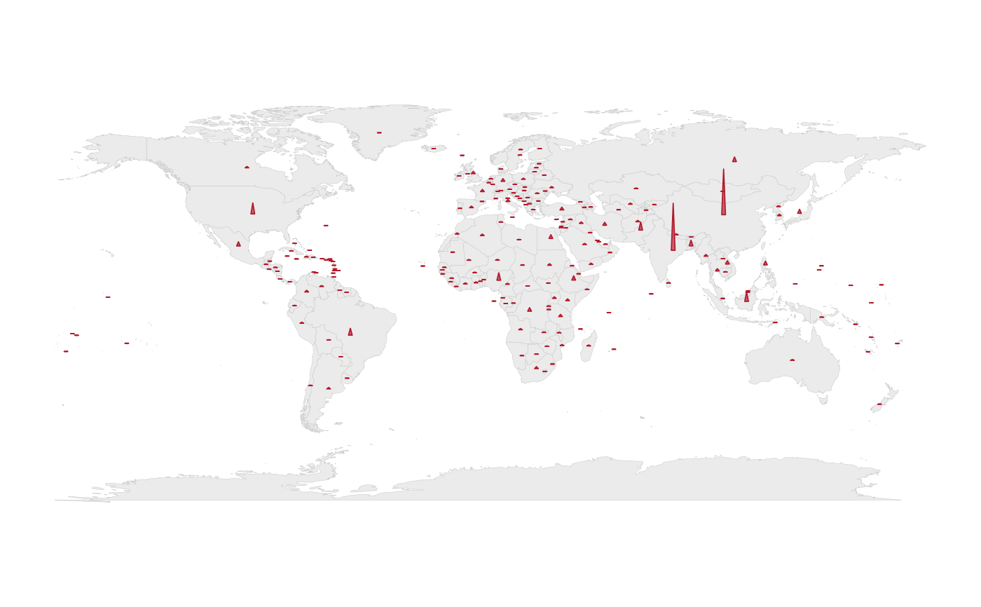
The classic "population spikes" display: a triangular spike at each country
centroid whose height encodes the value. Like bubble_map() it is the
honest idiom for totals, with a different visual trade-off: spikes
overplot less in dense regions (Europe, the Caribbean) because they only
grow upward. Uses the polygon backend, so it needs no extra package.
Usage
spike_map(
  data,
  height,
  max_height = 20,
  width = 1.6,
  color = "#B2182B",
  alpha = 0.65,
  projection = "equal_earth",
  footnote = "auto"
)
Arguments
- data
A country-level frame with
iso3cand theheightcolumn.- height
The column controlling spike height (unquoted).
- max_height
Height of the tallest spike, in degrees of latitude (default
20). On a projected map that is a ground distance (one degree is about 111 km) laid out in the projection's own units, so every spike uses the same scale wherever it stands; withprojection = "none"or"orthographic"it is in the map's degrees.- width
Base width of each spike, in degrees of longitude at the equator (default
1.6), measured the same way.- color
Spike colour (default a warm red).
- alpha
Spike fill transparency.
- projection
Map projection, as in
world_map()(default"equal_earth").- footnote
The caption:
"auto"(default) states the coverage and source, a string is used as given,FALSEadds nothing. Seeworld_map().
Examples
# \donttest{
spike_map(countryatlas::world_snapshot$countries, population)
#> Warning: population: 1 country is not drawn -- no bundled centroid.
#> • "GIB"
#> ℹ They are counted as missing in the caption and in `map_provenance()`.
 # }
# }