The goal of countryatlas is to get country data onto a map with as little friction as possible, using ISO codes as the universal join key. The happy path is a single call.
A map-ready tibble in one call
With a live connection, world_data(year) returns
everything you need:
data_2020 <- world_data(2020)To keep this vignette offline, we use the bundled snapshot and attach geometry ourselves:
data_2020 <- attach_geometry(world_snapshot$countries, geometry = "polygon")Your first choropleth
No geom_polygon() boilerplate — world_map()
does it:
world_map(data_2020, gdp_per_capita, style = "quantile",
          title = "GDP per capita")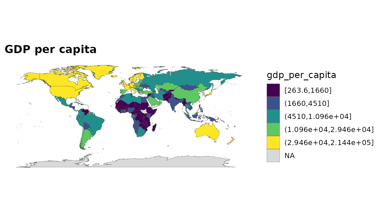
Income is an ordered factor, so a categorical fill reads naturally:
world_map(data_2020, income, style = "categorical")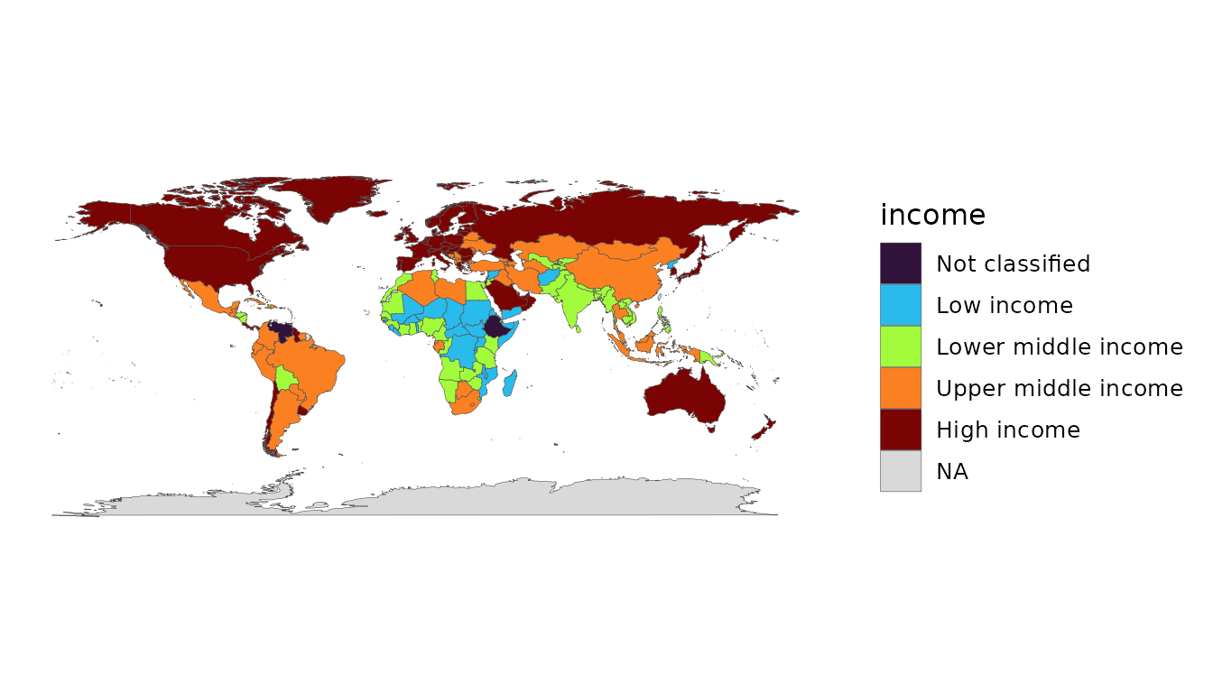
Choosing indicators
You are not limited to GDP. Pass any World Bank indicator code (named, for clean columns), or browse the bundled catalogue:
head(common_indicators)
#> # A tibble: 6 × 3
#>   name                   code           description
#>   <chr>                  <chr>          <chr>
#> 1 population             SP.POP.TOTL    Population, total
#> 2 gdp                    NY.GDP.MKTP.CD GDP (current US$)
#> 3 gdp_constant           NY.GDP.MKTP.KD GDP (constant 2015 US$)
#> 4 gdp_per_capita         NY.GDP.PCAP.KD GDP per capita (constant 2015 US$)
#> 5 gdp_per_capita_current NY.GDP.PCAP.CD GDP per capita (current US$)
#> 6 gni_per_capita         NY.GNP.PCAP.CD GNI per capita (current US$)
Or search the full World Bank catalogue by name — offline, against
WDI’s bundled indicator cache:
head(wdi_search("renewable energy"))
#> # A tibble: 4 × 2
#>   indicator                    name
#>   <chr>                        <chr>
#> 1 2.1_SHARE.TOTAL.RE.IN.TFEC   Renewable energy consumption(% in TFEC)
#> 2 3.1_RE.CONSUMPTION           Renewable energy consumption (TJ)
#> 3 4.1.2_REN.ELECTRICITY.OUTPUT Renewable energy electricity output (GWh)
#> 4 EG.FEC.RNEW.ZS               Renewable energy consumption (% of total final e…
country_data(2020, c(life_exp = "SP.DYN.LE00.IN", pop = "SP.POP.TOTL"))