Encapsulates the choropleth boilerplate and goes beyond a single style.
Auto-detects the polygon vs sf backend, applies theme_world_map(), and
projects the map (Equal Earth by default). Classes are the default because
a continuous fill on a skewed indicator hides almost all the variation;
binning is the honest default for choropleths, and quantiles the safe
choice for a general audience.
Usage
world_map(
  data,
  fill,
  style = c("quantile", "continuous", "binned", "equal", "jenks", "fisher", "headtails",
    "sd", "fixed", "categorical"),
  projection = "equal_earth",
  palette = NULL,
  n_bins = 5,
  breaks = NULL,
  midpoint = NULL,
  borders = TRUE,
  title = NULL,
  legend = NULL,
  na_label = "No data",
  recenter = NULL,
  na_style = c("grey", "hatched", "outline", "omit"),
  footnote = "auto",
  classification_report = FALSE,
  uncertainty = NULL,
  n_uncertainty = 3,
  disputes = c("ignore", "mark"),
  small_states = c("auto", "none", "dots"),
  small_area_km2 = 1000,
  engine = c("ggplot2", "tmap")
)
Arguments
- data
A map-ready frame from
world_data()/join_world()(polygon tibble orsf).- fill
The fill column (unquoted).
- style
How the fill is classified:
"quantile"(default),"continuous"(a colourbar),"binned"or its alias"equal"(equal intervals, drawn as a stepped colourbar),"jenks"and"fisher"(natural breaks; both needclassInt),"headtails"(Jiang 2013, for heavy-tailed variables such as GDP and population; it chooses its own number of classes),"sd"(the mean plus or minus whole and half standard deviations),"fixed"(the classes given inbreaks, which implies it) or"categorical"for a discrete column. Passstyle = "continuous"for the 3.0.0 default.- projection
Any of the projections in
projection_info():"equal_earth"(default),"robinson","mollweide","natural_earth","plate_carree","mercator","winkel_tripel","eckert4","gall_peters","orthographic","azimuthal_equal_area","north_polar"or"south_polar"; or"none"for unprojected longitude/latitude, the polygon backend's output before 4.0.0. Both backends project; see Projections on the polygon backend below.- palette
Optional palette: a viridis option (
"viridis", the default,"magma","cividis", ...) or any base R HCL palette (grDevices::hcl.pals()), such as the diverging"RdBu".- n_bins
Number of classes for the classed styles.
- breaks
Fixed class boundaries: a sorted, unique numeric vector of at least two values, for thresholds that mean something (the World Bank's income thresholds) and for maps that must be comparable across years and publications. Implies
style = "fixed". Classes close on the left, soc(1136, 4466)puts 1,136 in the first class. Values outside the range go in open end classes, labelled"< 1.14K"and">= 4.47K", with a warning (classcountryatlas_breaks_open) unlessbreaksstarts with-Infor ends withInf.- midpoint
A value to centre a diverging palette on: zero growth, a target, a threshold. On a colourbar the scale is rescaled so
midpointtakes the neutral colour; with classes, a break is forced there and the classes either side take the two arms of the palette. The palette defaults to"RdBu"; a sequential one is refused (classcountryatlas_palette_not_diverging).- borders
Draw country borders (default
TRUE).- title, legend
Optional plot title and legend title.
- na_label
Legend key label for missing data, used by the styles with a discrete legend (
"quantile","jenks","categorical"); the continuous and binned colourbars have noNAkey to name. Honoured by both engines. A length-1NAleaves the engine's own formatter alone.- recenter
Optional central meridian (e.g.
150for a Pacific-centred map), on either backend.- na_style
How to draw countries with no data:
"grey"(default),"hatched"(diagonal hatching via the optionalggpattern, unmistakable and greyscale-safe; grey, with a message, whenggpatternor thesfit draws with cannot be loaded),"outline"(white fill, keeping only the border) or"omit"(do not draw them at all). See the section below.- footnote
The caption.
"auto"(default) states the coverage ("174 of 195 countries shown; 21 missing") and, where the data carries asource_info()record, the source, so the map cannot quietly overstate what it covers. A string is used verbatim;FALSE(orNULL) adds nothing.- classification_report
If
TRUE, attach the breaks, the method and the count of countries per class to the returned plot as the"countryatlas_classification"attribute, and print them withmap_provenance(). A map whose top class holds one country and whose bottom holds ninety is misleading, and the counts say so immediately.style = "continuous"draws a colourbar and so has no classes to report: there the attribute isNULLand a warning says why.- uncertainty
Optional uncertainty column (unquoted) – a standard error, a confidence half-width, anything where larger means less certain. Supplying it switches the fill to a value-suppressing uncertainty palette (Correll, Moritz & Heer 2018): the value range contracts as uncertainty rises, so an uncertain estimate cannot claim an extreme colour, and the legend becomes the value x uncertainty grid.
- n_uncertainty
Number of uncertainty levels for the VSUP (default
3).- disputes
"ignore"(default) or"mark", which outlines the disputed_territories present in the data and notes the convention in the caption. Seedispute_policy().- small_states
What to do with countries too small to see, or missing from the basemap:
"auto"(default) draws a country that has a value but no polygon – most small states on thesfbackend at its default 1:110m – as a filled point at its centroid, on the same fill scale;"dots"also adds a point over every country smaller thansmall_area_km2;"none"drops them, as 3.0.0 did. The caption counts the points, and names any country with neither a polygon nor a centroid.- small_area_km2
The area under which
small_states = "dots"adds a point (default1000square kilometres).- engine
"ggplot2"(default) or"tmap". The package is ggplot2-native; thetmappath is an alternative renderer for people already working in tmap, and needs ansfframe. It honoursstyle,n_bins,palette,titleandlegend, and ignores the ggplot2-specific arguments.
Missing data is not zero
The default grey reads as "low" to many people, which is exactly wrong for
"unknown". na_style = "hatched" draws diagonal hatching instead –
unambiguous, and it survives greyscale printing. "omit" leaves a hole,
which is honest but can be mistaken for ocean. Whichever you pick,
footnote = "auto" states the count in words:
world_map(mapdf, gdp_per_capita, na_style = "hatched", footnote = "auto")coverage_map() goes further and maps availability itself.
Projections on the polygon backend
The polygon backend (the default of attach_geometry(), world_data() and
join_world()) keeps its frame in longitude and latitude and is projected
when it is drawn. Where sf can be loaded that is
ggplot2::coord_sf() with default_crs = sf::st_crs(4326), so any layer
you add in longitude and latitude is projected with the map, point by
point: the map's own outlines are dense, so a segment is drawn straight
between its two projected ends rather than re-interpolated, and a long line
of your own needs points along it to follow the projection. Where it
cannot, Equal Earth is computed by the package itself, on the sphere, and
the vertices are drawn in metres under ggplot2::coord_fixed(); place your
own layers on that map with project_lonlat(), and zoom with zoom_map(),
which keeps the projection where coord_quickmap(xlim, ylim) would replace
it. Another projection without sf falls back to that Equal Earth with a
warning (class countryatlas_projection_fallback). "orthographic" draws
through ggplot2::coord_map() and needs mapproj. map_provenance()
records which of these drew the map: "equal_earth", "equal_earth (spherical, built-in)" or "none".
Choosing a classification
The classification changes what readers conclude, and not by a little.
Brewer & Pickle's 56-subject study over nine map series found quantiles
among the best methods for general choropleth reading, and natural breaks
(Jenks) below 70% as accurate – the opposite of the common GIS default.
style = "quantile" is therefore the safe choice for a general audience.
Jenks earns its place on strongly clustered distributions, where quantiles
would split a natural group across two colours. Use classify_compare() to
see the difference on your own data before committing.
References
Brewer, C. A. & Pickle, L. (2002). Evaluation of methods for classifying epidemiological data on choropleth maps in series. Annals of the Association of American Geographers 92(4), 662-681. doi:10.1111/1467-8306.00310
Correll, M., Moritz, D. & Heer, J. (2018). Value-suppressing uncertainty palettes. Proceedings of the 2018 CHI Conference on Human Factors in Computing Systems, 1-11. doi:10.1145/3173574.3174216
Examples
# \donttest{
snap <- countryatlas::world_snapshot$countries
mapdf <- attach_geometry(snap, geometry = "polygon")
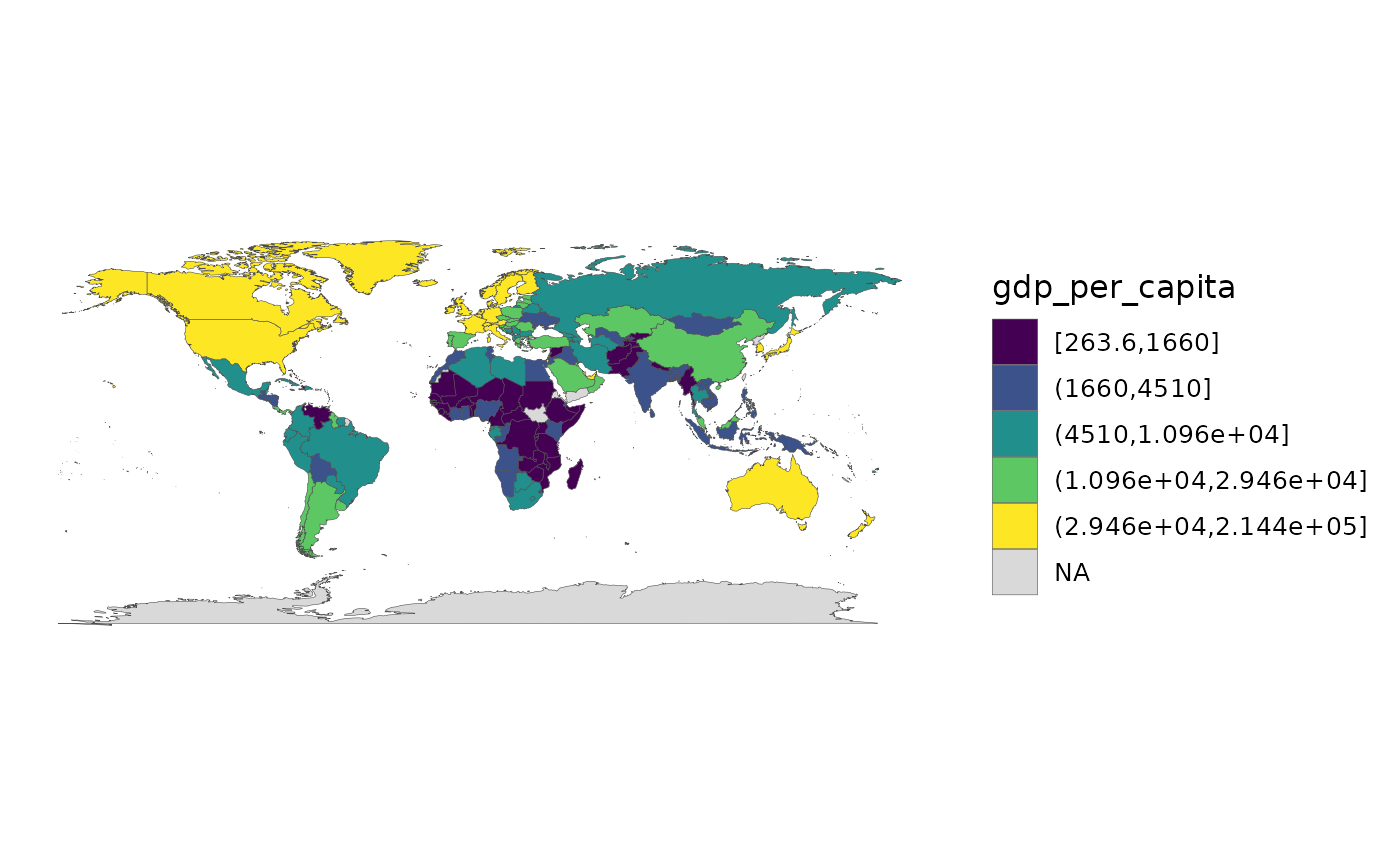
world_map(mapdf, gdp_per_capita, style = "quantile")
 # }
# }