
A tour of what geom_taichi() can look like. Every plot
below is a single layer call plus ordinary ggplot2.
One legend, two fish
When the two sources share units, shared_legend = TRUE
paints both fish with one palette on one scale, so the two halves of
every glyph can be read against a single legend. The bundled
cafes_tg data (synthetic espresso vs. matcha orders) is
made for this:
ggplot(cafes_tg, aes(x = week, y = neighbourhood)) +
  geom_taichi(yin = matcha, yang = espresso,
              shared_legend = TRUE,
              yin_name = "orders / 100 customers") +
  remove_padding() +
  theme_taichi() +
  ggtitle("Espresso (yang) vs matcha (yin), one shared scale")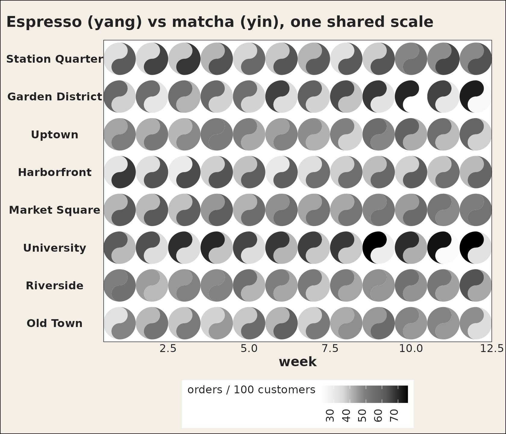
Two palettes, shared limits
Keep each source’s own palette but align the limits, so equal values carry equal ink:
ggplot(cafes_tg, aes(x = week, y = neighbourhood)) +
  geom_taichi(yin = matcha,   yin_name = "Matcha",
              yin_colors  = c("#deebf7", "#3182bd", "#08306b"),
              yang = espresso, yang_name = "Espresso",
              yang_colors = c("#fee6ce", "#e6550d", "#7f2704"),
              shared_limits = TRUE) +
  remove_padding() +
  theme_taichi()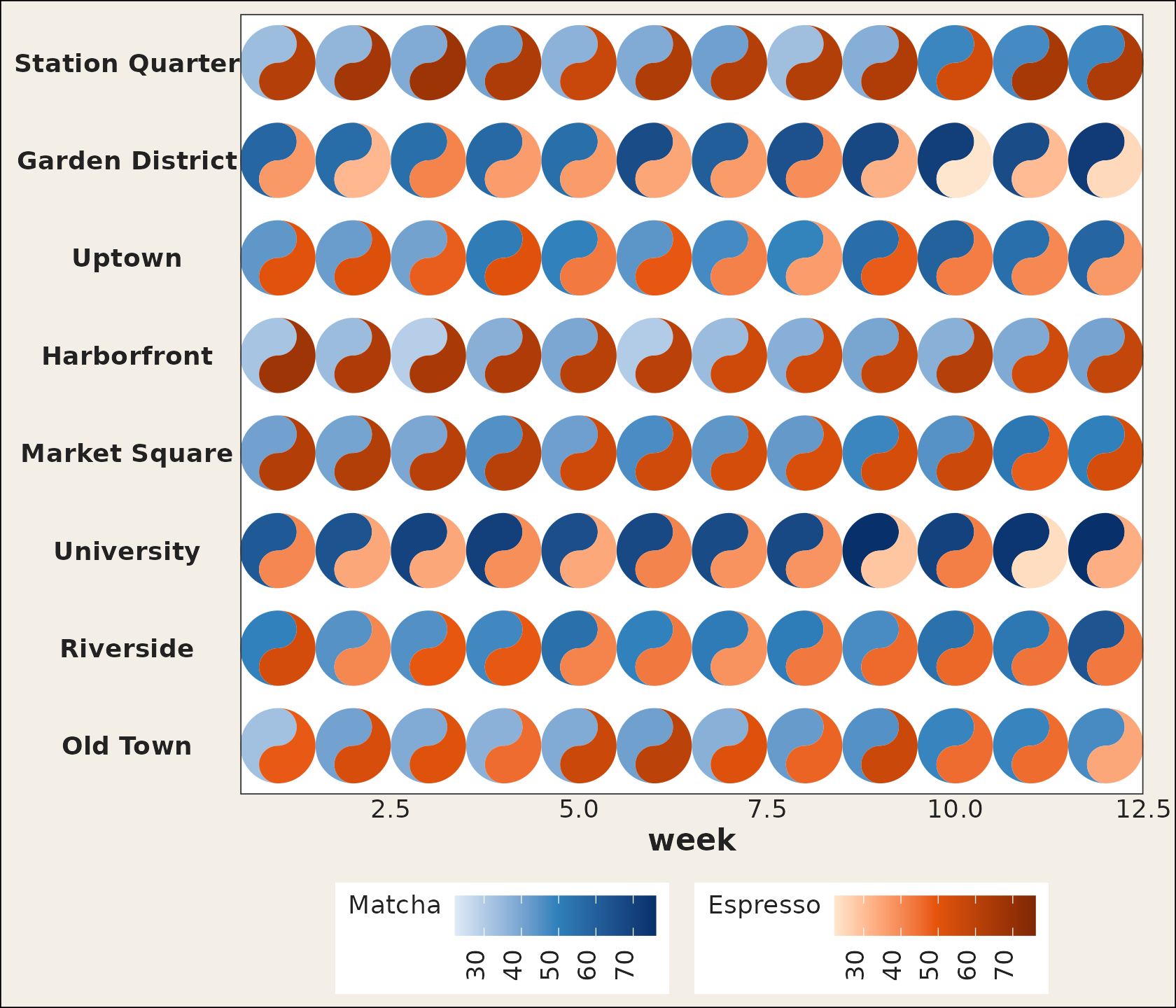
Classic eyes, data-driven eyes
d <- data.frame(x = 1:4, y = 1, yin = c(2, 4, 6, 8), yang = c(8, 6, 4, 2),
                pull = c(30, 5, 18, 45))

ggplot(d, aes(x, y)) +
  geom_taichi(yin = yin, yang = yang, eyes = TRUE,
              yin_eye_size = pull, yang_eye_size = 0.12,
              limits = c(0, 10)) +
  coord_fixed() +
  theme_taichi() +
  ggtitle("Eye size as a fifth channel")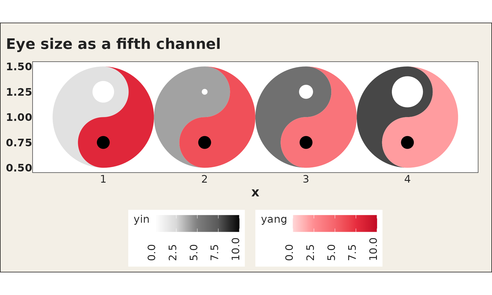
A turning grid
Rotation can be pure annotation or a data channel. Here each glyph’s angle encodes its column:
grid16 <- expand.grid(x = 1:4, y = 1:4)
grid16$yin <- seq(1, 10, length.out = 16)
grid16$yang <- rev(grid16$yin)
grid16$turn <- grid16$x * 22.5

ggplot(grid16, aes(x, y)) +
  geom_taichi(yin = yin, yang = yang, angle = turn, eyes = TRUE,
              limits = c(0, 10)) +
  coord_fixed() +
  theme_taichi()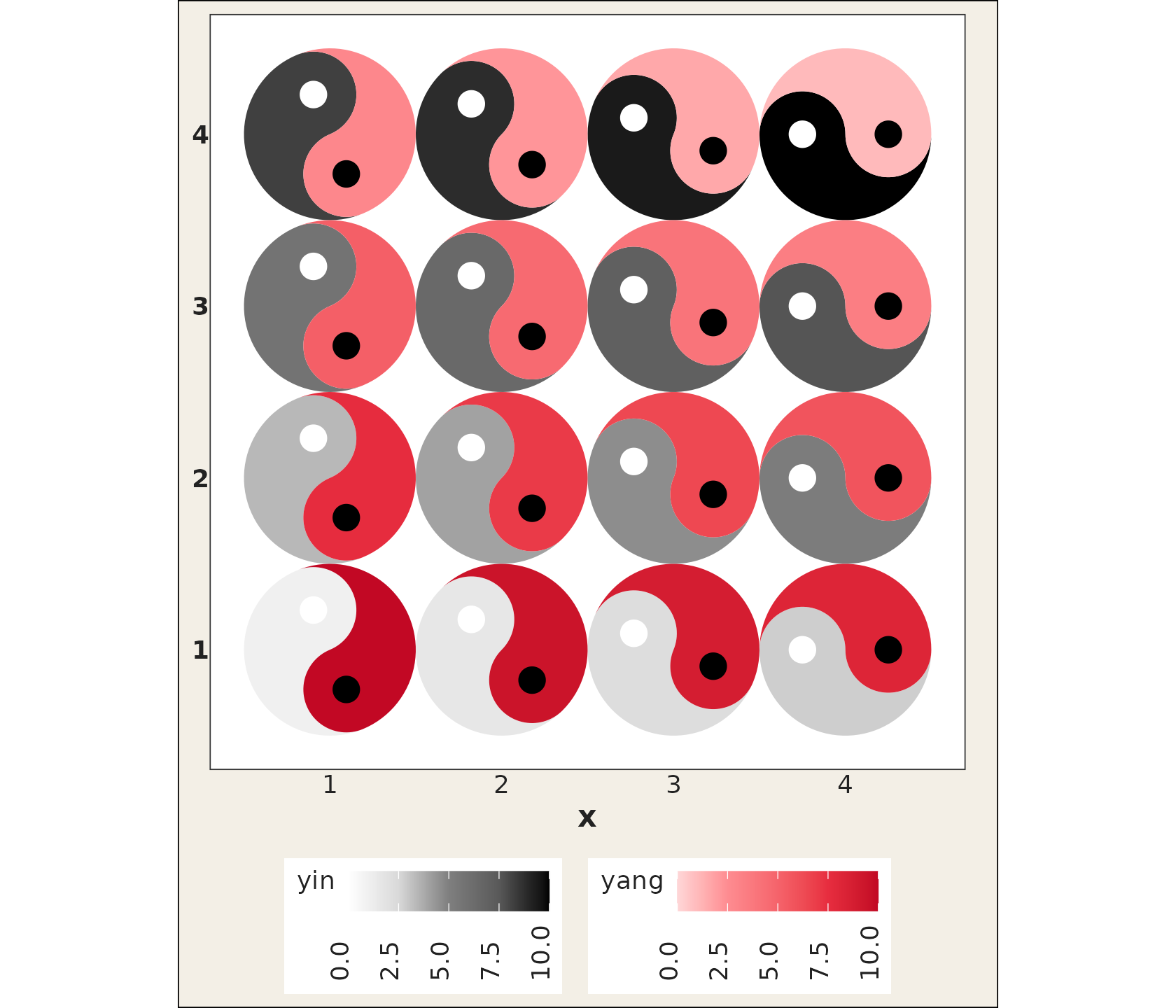
Categorical fills
d9 <- expand.grid(x = 1:3, y = 1:3)
d9$roast  <- factor(c("light", "medium", "dark")[(d9$x + d9$y) %% 3 + 1])
d9$origin <- factor(c("blend", "single")[(d9$x * d9$y) %% 2 + 1])

ggplot(d9, aes(x, y)) +
  geom_taichi(yin = roast, yang = origin) +
  coord_fixed() +
  theme_taichi()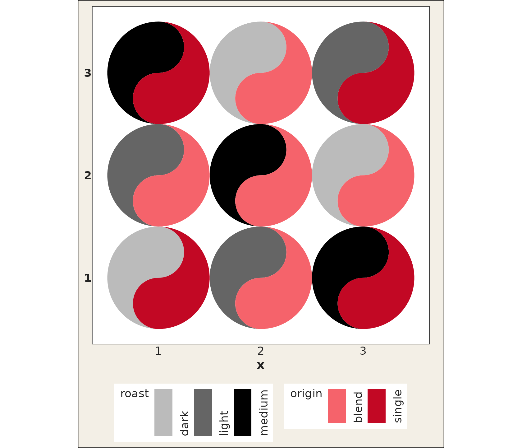
Texture at scale
Dense grids stop being symbols you read one by one and become a texture of two interleaved fields, which is still useful for spotting bands and regime changes:
ggplot(subset(states_tg, state %in% c("New York", "Texas")),
       aes(x = week, y = category)) +
  geom_taichi(yin = Twitter, yang = Google) +
  facet_wrap(~ state, ncol = 1) +
  remove_padding() +
  theme_taichi() +
  ggtitle("31 weeks as texture")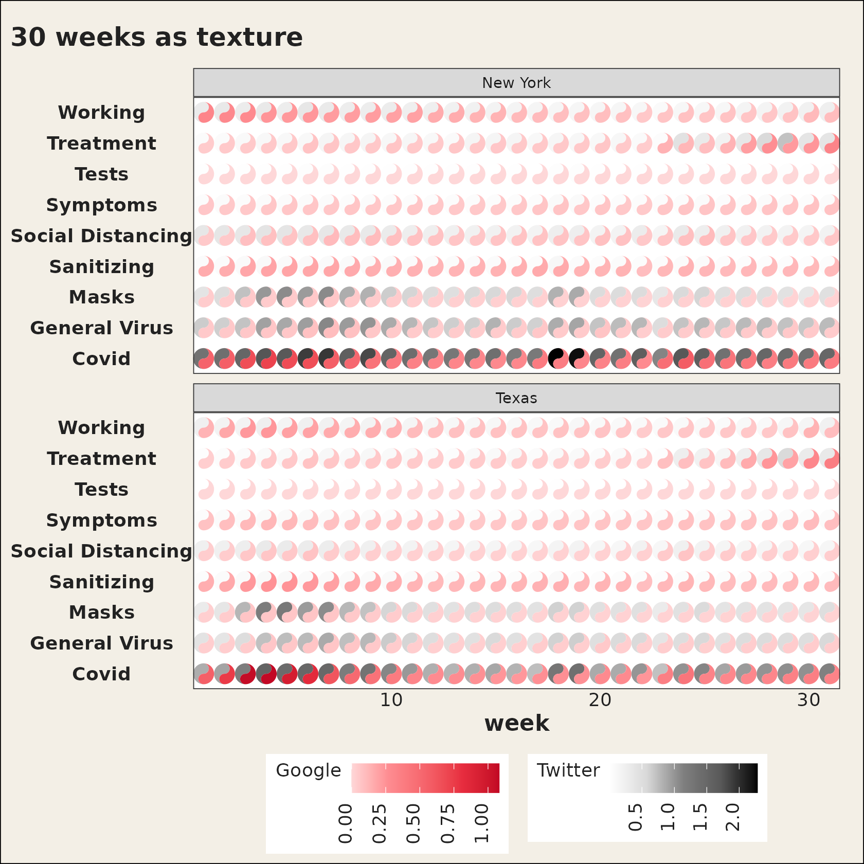
Bring your own scales
yin_scale / yang_scale accept any fill
scale, and the exported geom_yin_fish() /
geom_yang_fish() let you assemble everything by hand (your
scales, your ggnewscale stacking):
ggplot(d, aes(x, y)) +
  geom_taichi(yin = yin, yang = yang,
              yin_scale = scale_fill_viridis_c,
              yang_scale = scale_fill_viridis_c(name = "yang", option = "magma")) +
  coord_fixed() +
  theme_taichi()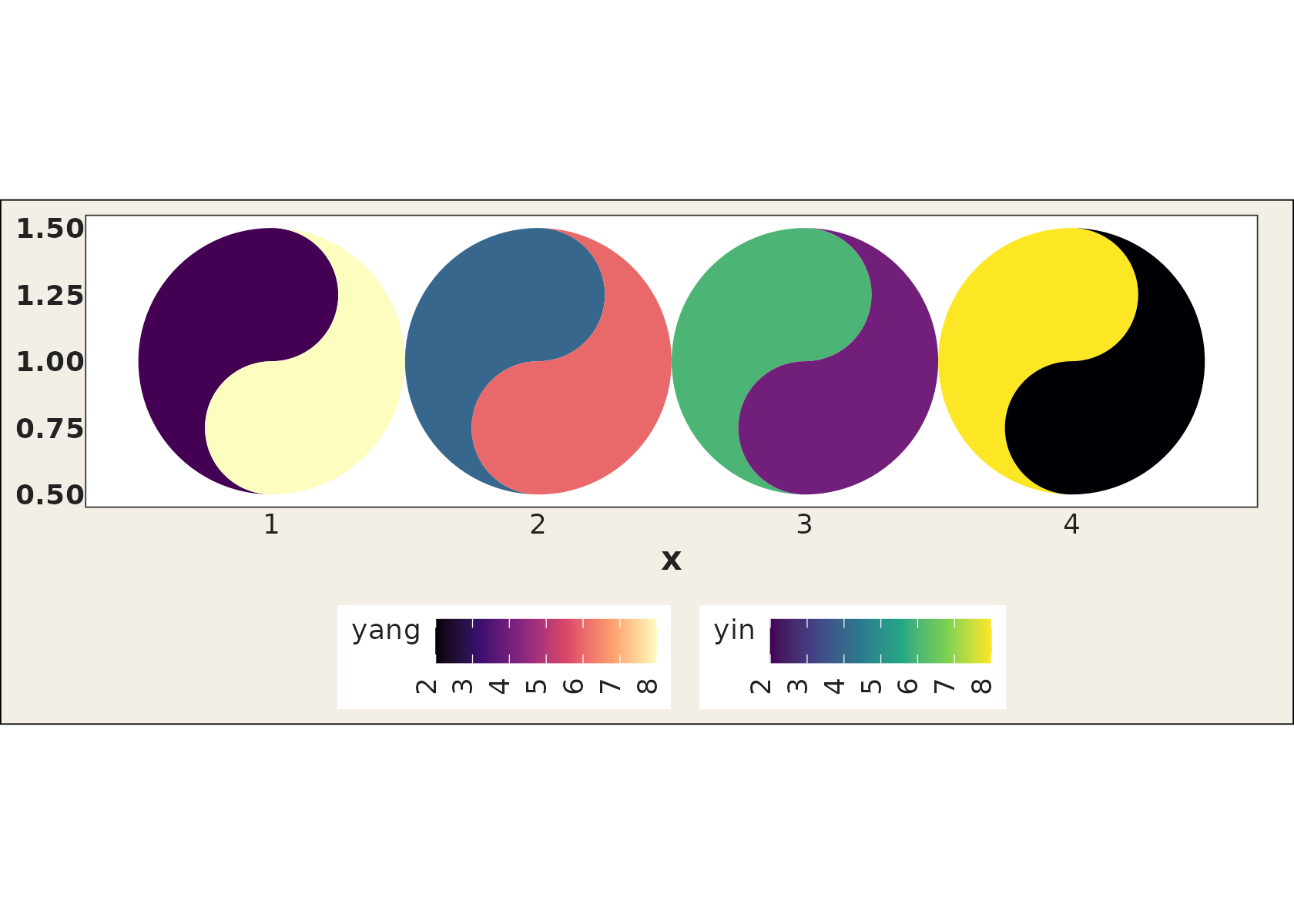
The gap, drawn three ways
explicit computes the relationship between the two
sources and shows it as a third channel. The eyes are the default:
subordinate to the fills, so the two sources stay the story, and absent
altogether where the sources agree:
ggplot(cafes_tg, aes(x = week, y = neighbourhood)) +
  geom_taichi(yin = matcha, yang = espresso,
              shared_legend = TRUE, yin_name = "orders / 100 customers",
              explicit = "difference") +
  remove_padding() +
  theme_taichi() +
  ggtitle("Eye size = the gap")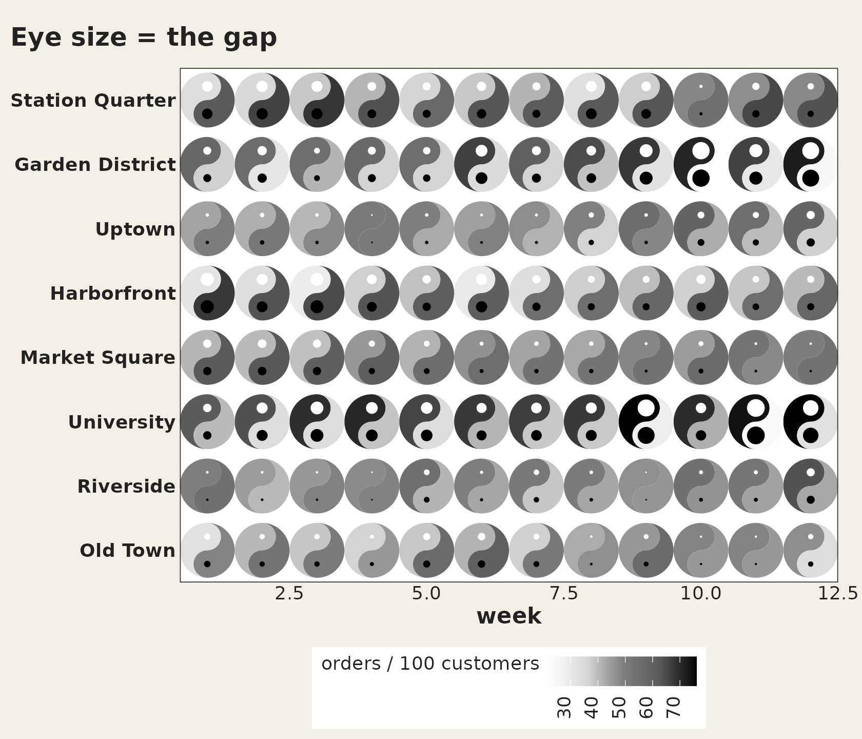
Tilt is the most accurate of the four channels, because direction is read far more precisely than shading. Upright means the two sources agree:
ggplot(cafes_tg, aes(x = week, y = neighbourhood)) +
  geom_taichi(yin = matcha, yang = espresso,
              shared_legend = TRUE, yin_name = "orders / 100 customers",
              explicit = "difference", explicit_channel = "angle") +
  remove_padding() +
  theme_taichi() +
  ggtitle("Tilt = the gap")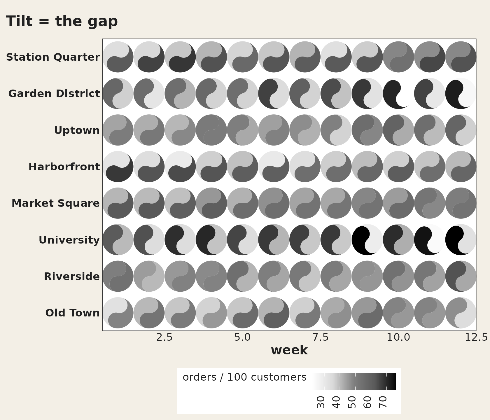
Or drop the glyph entirely when the gap is the question:
ggplot(cafes_tg, aes(x = week, y = neighbourhood)) +
  geom_taichi_diff(yin = matcha, yang = espresso) +
  remove_padding() +
  theme_taichi() +
  ggtitle("matcha - espresso")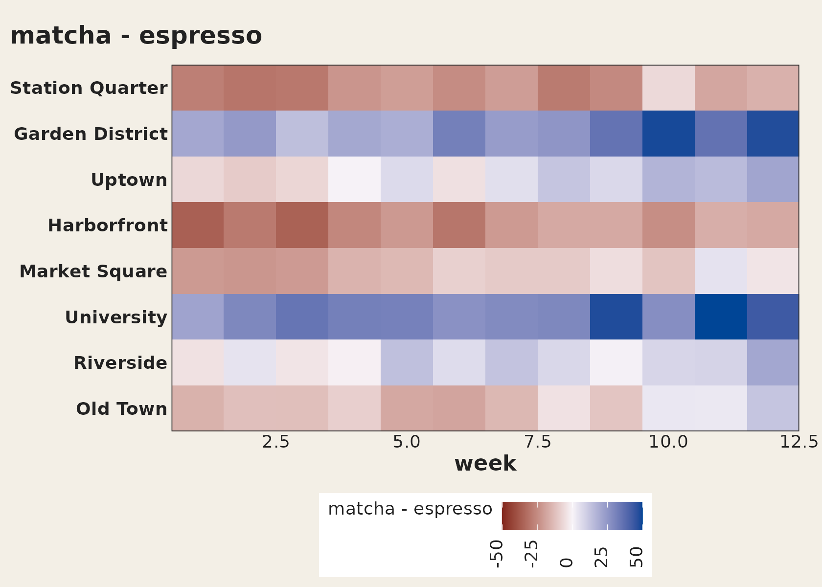
A fair pair of palettes
First the package defaults, then palette = "balanced".
The data is symmetric (both fish carry the same value in every cell), so
a fair pair should make the two halves of every glyph look equally
heavy. Only one of them does:
same <- data.frame(x = 1:6, y = 1, a = seq(1, 10, length.out = 6))
same$b <- same$a

both <- function(pal, title) {
  ggplot(same, aes(x, y)) +
    geom_taichi(yin = a, yang = b, palette = pal, shared_limits = TRUE,
                show.legend = FALSE) +
    coord_fixed() +
    theme_taichi() +
    ggtitle(title)
}

both("default", "palette = \"default\"")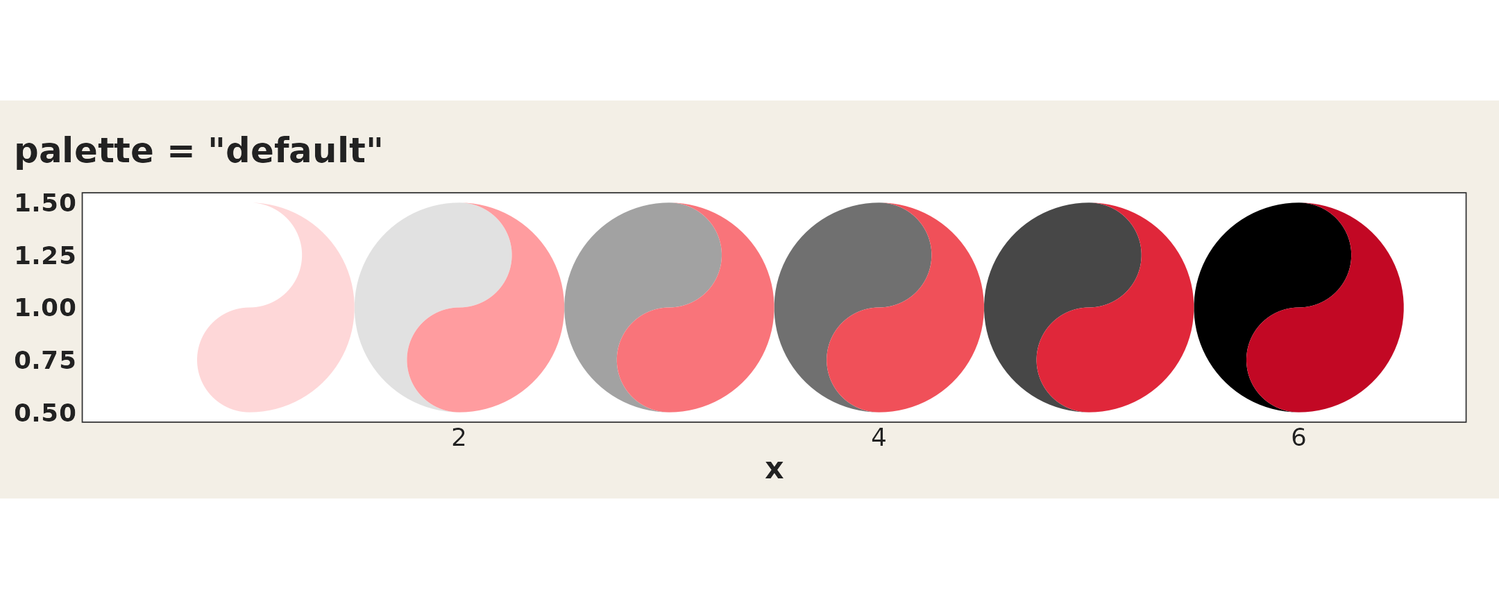
both("balanced", "palette = \"balanced\"")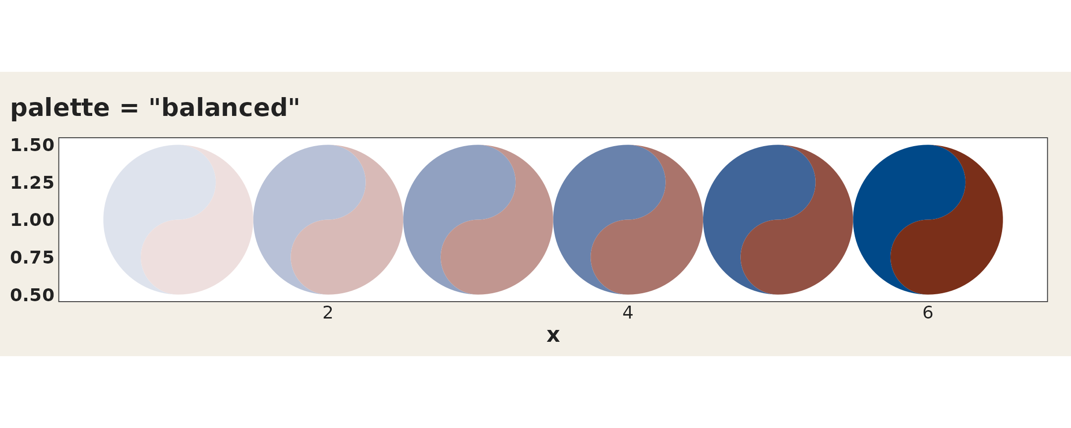
And the measurement behind it:
taichi_check_palette()
#> <ggtaichi palette check>
#>
#>   step yin            L      C   yang           L      C       dL
#>   1    #FFFFFF    100.0    0.0   #FED7D8     89.2   14.5     10.8
#>   2    #EBEBEB     93.0    0.0   #FFB2B3     79.8   30.2     13.2
#>   3    #D8D8D8     86.3    0.0   #FE8C91     70.8   46.6     15.6
#>   4    #AAAAAA     69.6    0.0   #F9787D     65.8   53.9      3.8
#>   5    #7F7F7F     53.2    0.0   #F4636B     61.0   61.4     -7.8
#>   6    #6B6B6B     45.2    0.0   #EE4B54     55.9   70.0    -10.7
#>   7    #595959     37.8    0.0   #E62C3F     50.7   78.1    -12.8
#>   8    #2D2D2D     18.5    0.0   #D41D31     45.8   77.1    -27.3
#>   9    #000000      0.0    0.0   #C10724     40.6   75.7    -40.6
#>
#>   largest luminance mismatch : 40.6 L* (tolerance 5.0)
#>   largest chroma mismatch    : 78.1
#>   measured in                : CIE Lab (L*, C*ab), CIE2000 distances
#>   how far apart the ramps stay (median distance, step for step)
#>       normal       27.2
#>       deutan       20.9
#>       protan       12.7  (much worse than normal vision)
#>       tritan       28.4
#>
#>   Verdict: FAIL
#>   the two ramps do not share a luminance trajectory, so equal
#>   values do NOT read as equal ink and one fish will appear to
#>   dominate. Consider `palette = "balanced"` or `taichi_palette_pair()`.
Binned fills
On a grid too dense to compare cell by cell, matching a patch to one of a few labelled bins beats reading a continuous ramp:
ggplot(subset(states_tg, state %in% c("New York", "Texas")),
       aes(x = week, y = category)) +
  geom_taichi(yin = Twitter, yang = Google,
              yin_scale  = scale_taichi_yin_binned(n.breaks = 5),
              yang_scale = scale_taichi_yang_binned(n.breaks = 5),
              shared_limits = TRUE) +
  facet_wrap(~ state, ncol = 1) +
  remove_padding() +
  theme_taichi()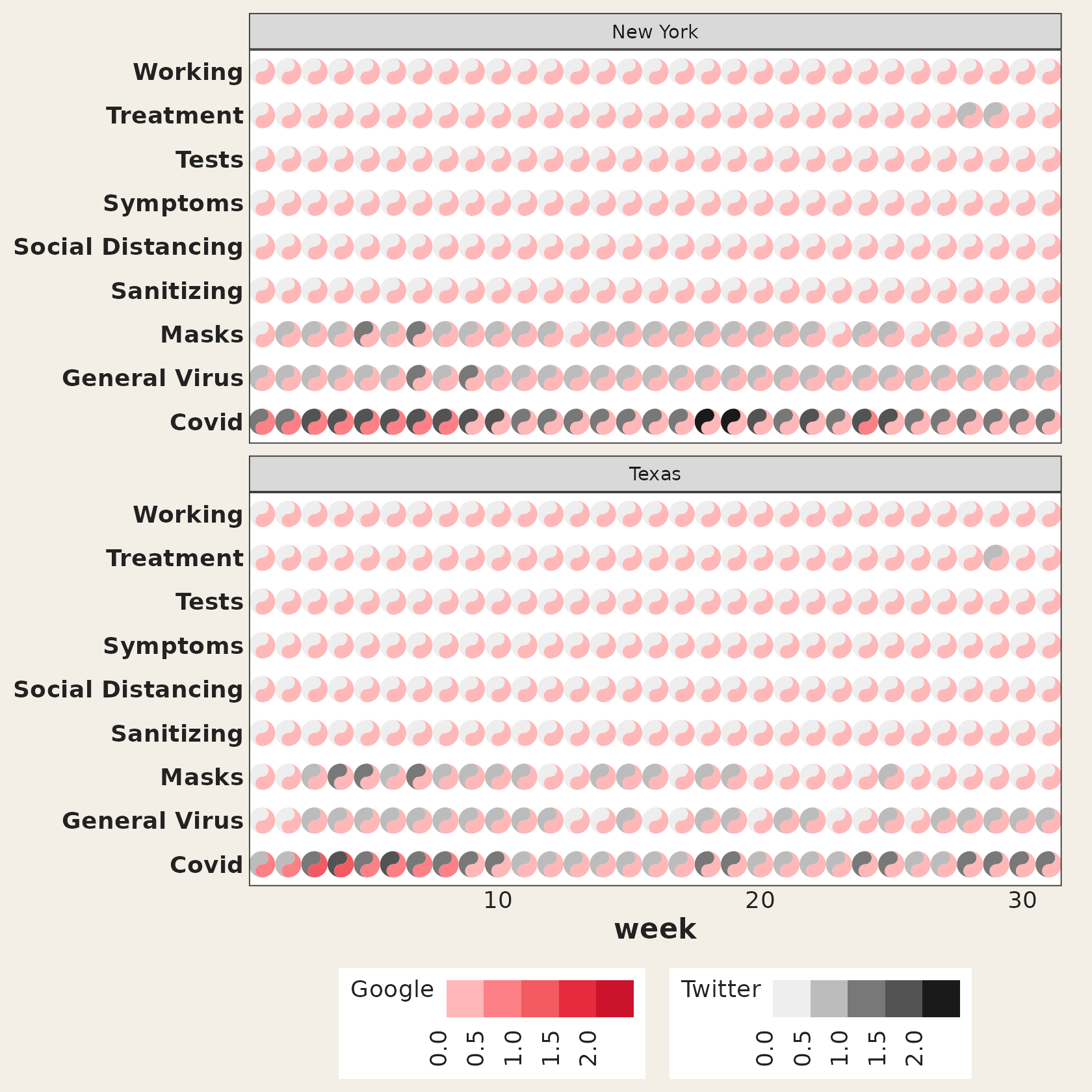
Interactive: hover one source, highlight it everywhere
interactive = TRUE hands the layers to ggiraph. Hover a cell
for the exact values and their difference; with
data_id_by = "source", hovering any yin fish highlights the
yin fish in every cell, which turns the superposition display
into a single-source display for as long as you hold the pointer
there.
p <- ggplot(cafes_tg, aes(x = week, y = neighbourhood)) +
  geom_taichi(yin = matcha, yang = espresso,
              shared_legend = TRUE, yin_name = "orders / 100 customers",
              interactive = TRUE, data_id_by = "source") +
  remove_padding() +
  theme_taichi()

ggiraph::girafe(
  ggobj = p,
  width_svg = 7, height_svg = 6,
  options = list(
    ggiraph::opts_hover(css = "stroke:#C20824;stroke-width:1.5px;"),
    ggiraph::opts_tooltip(
      css = "background:#f3efe6;border:1px solid #222;padding:6px;border-radius:3px;"
    )
  )
)